Westminster College | Prospective Student Website
I overhauled the college’s 500+ page website, conceptualizing and creating countless pages of web content.
The challenge
Over the years, Westminster had amassed an enormous website. Every program chair and department head had editing access to the site and there was no centralized team overseeing the creation or maintenance of web content. Years of neglect and an ad-hoc approach to content had become culturally ingrained. The result was a clunky, ineffective website with poor user experience and low conversion.
The college was also in the middle of a rebrand and the entire website needed to be aligned with the new brand guidelines.
The approach
What the college needed more than anything was a clear strategic vision for their digital content and online presence. I worked with the college’s sole web developer to expand the web team, creating content strategy, UX design, and digital content manager positions.
With our increased bandwidth, we were able to start from the ground up, developing better processes for managing the website and creating a strategic vision for our work.
I collaborated with the UX designer to develop an overarching strategy for the site, combining content and design to curate an effective and compelling user experience. Our main priority was to get users where they wanted to go, and fast.
We tackled everything from the homepage, key landing pages, campaign pages, and every program page. With each project, we focused on engaging users with relevant, on-brand content tailored to their needs.
The work
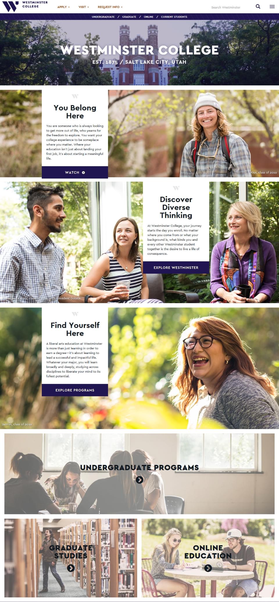
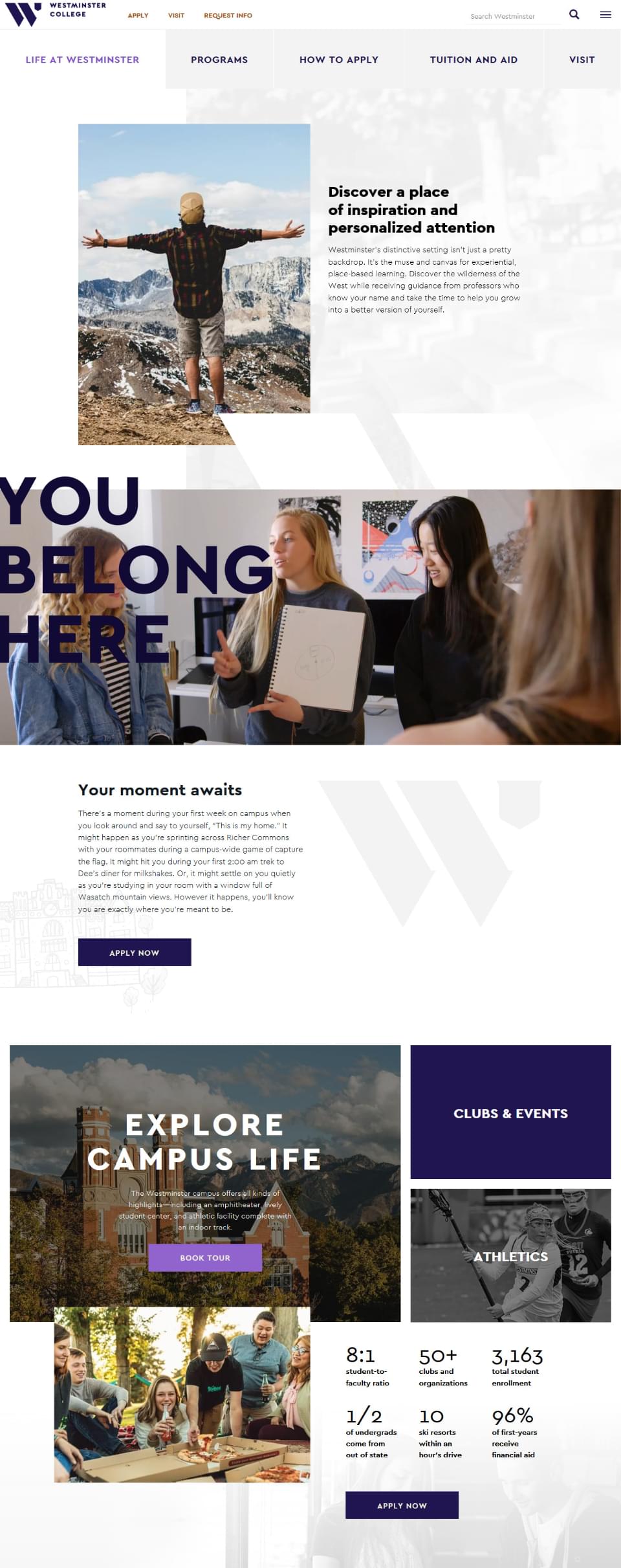
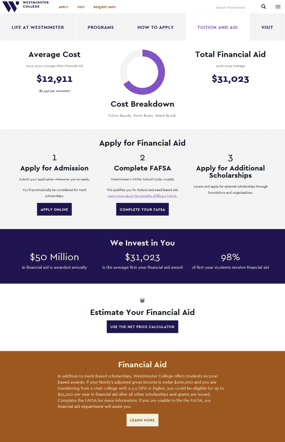
The homepage became a highly branded funnel, setting the tone for the overall experience while getting users to relevant content as quickly as possible. We created hubs for our different audiences—undergraduate, graduate, and online students. Once there, users had access to the information they wanted and needed. For each group, we covered academics, campus life, tuition and aid, and admissions—each carefully crafted with the specific audience in mind.
The results
Our goal was simple: support the college’s enrollment efforts by improving the user experience.
Six months after launch, analytics showed a 33% increase in traffic to academic (conversion) pages, a 22% decrease in global bounce rate, and a 15% increase in academic applications via the website.


